I have recently read this article from the guardian discussing how phone apps such as Instagram and Hipstamatic are lowering the bar of photography.
http://www.guardian.co.uk/technology/2012/jul/19/instagram-debasing-real-photography
I have to disagree, actually, as I believe that instagram is introducing the idea of photography to many people it would not normally reach, and is allowing it to be a fun way of expressing something without the pressure of taking an amazing shot.
"Slapping a filter on makes images look the same, gets in the way and spoils the picture."
Once again I have to disagree with the writer, sometimes using a filter can enhance the feel and texture of the subject within the image - the same way an ISO can add grain. But the same with the idea of grain, some photographers cannot bear the thought of it whereas others completely disagree and love to include it within their photographs. We are living in a digital ages however we all seem to love to cling on to that sense of nostalgia and have an obsession with the past. Using the filters within the programs can give this feel to people and perhaps add another dimension to the modern looking image we wouldn't otherwise have. As for the images all looking the same - there are various different pieces of software all with a near endless supply of filters and effects, leaving it hard for images to look the same - especially when each photo is taken in a slightly different light, or of a difference subject, or in a different setting. Overall it allows people to be creative, especially when composing images, and the feature of adding different filters and effects just allows people to explore the actual editing process of an image other photographers are familiar with.
"You can create extraordinary images using software, and I adore the possibilities that software brings to images."
Here the writer actually admits that she loves the possibility that software can bring to the images, so is she just being 'snobbish' about the possibilities that mobile editing software can bring to photography? I myself have an instagram account, and I just use it to post everyday events that my mobile phone captures if I don't have my Nikon to hand (it's a rather large camera - its not something I can carry around as easily as my phone). However, even though I have a smartphone the camera on it often blurs and is very grainy and unclear, and has a very slow shutter speed. Adding filters I think can sometimes - heavy emphasis on the sometimes - when used in a subtle way can improve the overall look of a camera phone image - again heavy emphasis on the camera phone - taking away from the imperfections such as motion blur and graininess. I also think some filters can add to the sentimentality of the images, rather than suck the life out of them, or add fake sense of history. Over time the image will gather history and love behind it, so the following statement I think is invalid.
"Also, by adding a faux-aged look to them, we in effect add a history, a longevity to the image that it intrinsically doesn't have"
Overall I believe the writer is in denial about photography of the 'WEB 2.0' age, and is taking a sort of pretentious attitude over towards who photography should be available to. Although photography can be a high art form, it can also be fun as well.
Thursday, 27 September 2012
Visualising
Why is visualisation important when taking a photograph?
In my opinion, visualisation is important when taking a photograph because without an initial idea for the overall composition, lighting and subjects of the image, the photograph is likely to be - for lack of a better word - a mess. If you just 'point and shoot' at an image, the artistic elements of an image aren't likely to be considered as much as if they would be if you visualised it first.
Why is visualising essential when creating pinhole images?
When it comes to pinhole images, visualising the image first is incredibly important because unlike other cameras it doesn't have a view hole. This means that when positioning your camera you need to have a good idea of what you want in the frame and what a certain position will capture as you can only open the shutter once per piece of photography paper. It is also much harder to edit pinhole images as they are developed in the dark room and therefore it is more important to visualise and get things correct before and during taking the photographs.
Wednesday, 26 September 2012
Vernacular photography
Vernacular photography is images taken by unknown or amateur photographers, concentrating on everyday life and things. Usually this refers to photographs such as family portraits, class pictures and images from photo booths rather than things with a larger importance. Often the images are unintentionally artistic and I believe that is why they have become so popular.
 This is a good example of what a vernacular photo stereotypically looks like. The subject matter is a birthday, more specifically the cutting of a cake, a normal event in most people's year. Vernacular photography always covers things that aren't out of the ordinary. However the image, I believe, is well composed - probably unintentionally - the two larger candles framing the family. The candles also create an element of shadow within the image, and the flash used gives it an element of tone and texture - the light bouncing off the walls giving a feel of the dark room and the reflection off the table suggests a smooth, polished texture. The artistic elements within the image come together to stop this being just a family photograph and turns it into a piece of vernacular art.

Found Photography
Found Photography is a genre of photography in which photographs that are either lost, unclaimed or discarded are 'found' by people, mainly artists, and are then recovered or displayed. It's themes follow vernacular photography, its subjects relating to everyday life and things, but the difference is that the photographer behind the image is unknown, along with the story and the subject's meaning. The mystery behind the image is the main cause of this genres appeal, allowing people to create and think about their own story to the photographs.

This image is an example of found photography. The subjects - the woman and the cat - are completely unknown, as well as the 'shooter' behind the image, however this image has been 'found' and recovered by someone and now recognised as a piece of art. Accidental, but art nonetheless. This is possibly due to the interesting composition of the photograph and how it makes the subjects look. The way the subjects are facing, the woman left and asleep and the cat right and staring, almost make them look as if they are polar opposites. The cat appears curious and thirsty to see the world, whereas the woman looks as though she is bored of seeing things. The way she is leaning her head against the cat, I think, shows a close, loving bond and I believe that emotion is important in a photograph. The way reflection is used in the image is effective, creating an almost mystical reflection in the car window, and lighting is also used well, streaming in in leading lines towards the cat.
Snapshot aesthetic
Snapshot aesthetic is a trend within photography which began in 1960's America. Like vernacular photography, snapshot aesthetic focuses on everyday life and subjects, however the framing of the image itself was often off; thus subjects were often cut off the image. The image presented by the artists of this trend usually had no link to each other and purely relied on juxtaposition and disjunction between the photographs. In my opinion this movement was popular because the images often look like a moment just captured rather than something set up and planned, and therefore the images have a large sense of realism.

Vernacular photography is images taken by unknown or amateur photographers, concentrating on everyday life and things. Usually this refers to photographs such as family portraits, class pictures and images from photo booths rather than things with a larger importance. Often the images are unintentionally artistic and I believe that is why they have become so popular.


I particularly like this vernacular image due to the emotions of the child being captured so well. The child in question looks particularly unperplexed at the prospect of being placed upon this strange horse-like toy, and possibly looks too nonchalant for a child her age, especially when someone is trying to cause them to have fun. The pole the child is holding creates a leading line in the image, drawing your eyes up from the hooves past the comical
face of the child. Depth of field is also used well in the image, the top half of the image being out of focus and, once more, bringing attention back to the intended subject. The image is composed well, bringing in the rule of thirds, and the contrast of the white and dark shades of the horse and the girl's coat create an attractive aesthetic affect.
Found Photography is a genre of photography in which photographs that are either lost, unclaimed or discarded are 'found' by people, mainly artists, and are then recovered or displayed. It's themes follow vernacular photography, its subjects relating to everyday life and things, but the difference is that the photographer behind the image is unknown, along with the story and the subject's meaning. The mystery behind the image is the main cause of this genres appeal, allowing people to create and think about their own story to the photographs.

Snapshot aesthetic
Snapshot aesthetic is a trend within photography which began in 1960's America. Like vernacular photography, snapshot aesthetic focuses on everyday life and subjects, however the framing of the image itself was often off; thus subjects were often cut off the image. The image presented by the artists of this trend usually had no link to each other and purely relied on juxtaposition and disjunction between the photographs. In my opinion this movement was popular because the images often look like a moment just captured rather than something set up and planned, and therefore the images have a large sense of realism.

This image, I think, is a good example of the snapshot aesthetic movement. The image itself was actually taken very recently, however it doesn't have a very modern look to the photograph due to the overall look and feel of the photograph. The dark lighting of the image makes the shot look very unplanned as they have not had time to organise the lighting, this is also shown through the glimmer of light from the bike handle, perhaps showing a flash has been used. The compostion of the image has cut off the subjects eyes suggesting - or rather wanting the viewer to think - that it has been taken quickly and this gives it a very amatuer feel. On the other hand, the image comes across as very unintentionally artistic, due to a good use of the rule of thirds with the bike and the subject, as well as the hints of light in the background. There is also a relatively small depth of field.
How do I think this could be used in my work?
For my theme 'sense of place' I think I could use venacular and snapshot aesthetic photography to give a feel of such places like homes, especially during events like birthdays, and also for street scenes, as often you cannot take too long planning candid street shots - you have to capture the moments quickly. I think I will also attempt to 'find' my own found photographs, especially if they link to my theme, and will look through family photo albums to see what is in there. I also think I could take inspiration for composition from these styles and movements, as they are different to the norm and give the images quite a retro feel which is uses for some places and capturing the emotions.
ISO for objects.
ISO 100 - finely detailed subject

ISO 400 - finely detailed subject

ISO 1600 - finely detailed subject

For the finely detailed subject I prefer the ISO 400 as it gives some grainy texture to the image, but not so much that it's either too dark or that it lessons the detail of the subject. I prefer some grain to add to the detail rather than a smoother image because I believe it enhances the texture.
ISO 100 - smooth, coloured object

ISO 400 - smooth, coloured object

ISO 1600 - smooth, coloured object

For the smooth, coloured object I prefered using ISO 100 as I think it best reflects the brightness and the smooth texture of the apple. Once the image becomes grainier the apple seems to lose some of the reflective texture it had in the ISO 100 image, most noticable in the ISO 1600 image as this creates the most grain.
Wednesday, 19 September 2012
Magazine photograms
Like we created photograms of objects previously in the darkroom, I created a photogram from a magazine image. I chose this particular page due to it linking into my theme 'sense of place'


Before being inverted -

After being inverted in photoshop -

I found that the details of the original image where mainly intact, however the images from the other side had come through, giving a layered and cluttered effect to the image. I could obtain this effect with my own images by printing on both sides of a piece of paper and developing them in the dark room.

I then added colour in photoshop to my magazine photogram. Instead of doing this realistically I decided to go with a partial coloured pop art affect to add to the clustered look.
ISO and Bracketing
Bracketing

This bracketing would mean that the image taken would be lighter.

This bracketing would mean that the image taken would be darker.
This is a neutral bracketing that would mean that the lighting would not be affected.
ISO
100 ISO is used for sunny, bright settings
200 ISO is used for more half cast outdoor settings
400/800 ISO is used for indoors.
1600 is also used for indoor settings.
3200 is used for night situations.
The higher the ISO the grainier the image itself will be, for example 100 will be clear whereas ISOs like 1600 and 3200 will have much more grain on the images taken.
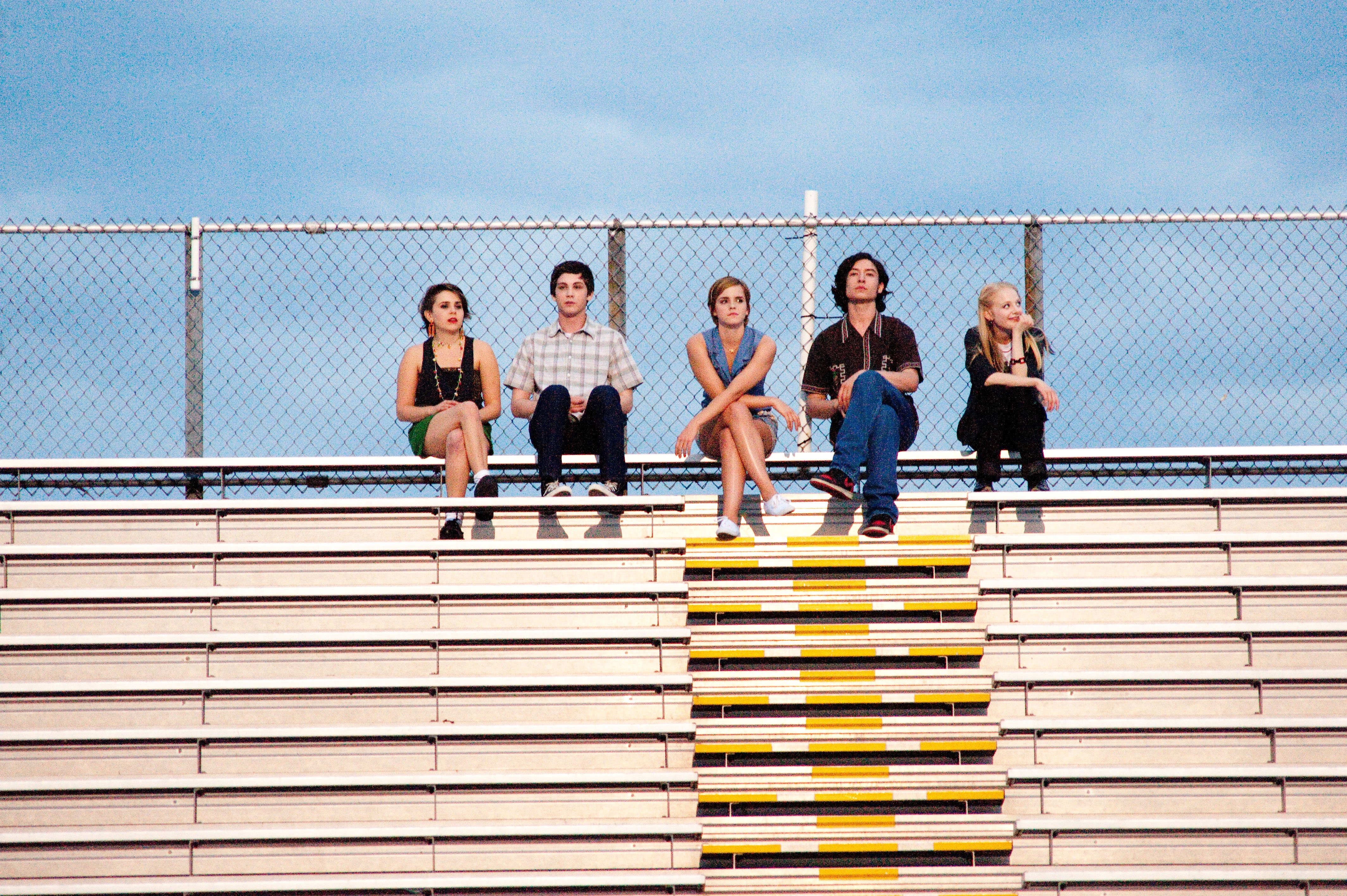
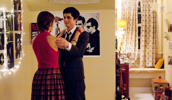
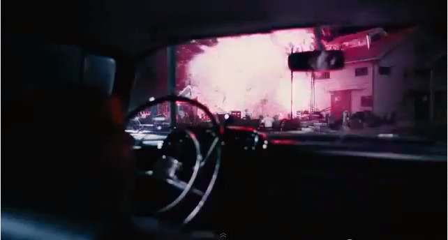
Cinematography of movie 'The Perks Of Being A Wallflower'
Following on from my last blog entry, I decided to look into the cinematography of upcoming film The Perks Of Being A Wallflower (2012), the film's cinematographer being Andrew Dunn. The films stills and shots are all very well composed, focusing less on straight forward angles and shots and more on less centre angles. Throughout the film a lot of the shots are sharp, using a large depth of field - otherwise known as a deep focus in cinematography - creating vivid, rich colours even in dark or little lighting. The shot of actress Emma Watson in a tunnel is blurred, which I believe help shows the quick movement and the excitement felt by the character in the film. Dunn makes the shots sharp when appropiate and less so when it is used to reflect a moment within the film, which in my opinion is valuable to the cinematography of the film. I particularly like the last shot of the blog entry, due to the use of subtle lighting and the composition of the image, which seems to lead the audiences eye towards the characters slowly, as to reflect the scene.


Tuesday, 18 September 2012
Cinematography and photography
What is cinematography?
Cinematography is the creation of motion picture images. It can involve the use of film or digital imagery, usually with a movie camera. It is closely related to the art of still photography. Many additional technical difficulties and creative possibilities arise when the camera and elements of the scene may be in motion.
Submarine (2010) cinematographer Erik Wilson
Suckerpunch (2011) cinematographer Larry Fong

The perks of being a wallflower (2012) cinematographer Andrew Dunn

The Social Network (2010) cinematographer Jeff Cronenweth

Dark Shadows (2012) cinematographer Bruno Delbonnel
List of cinematographers
- Robert Richardson
- Wally Pfister
- Mauro Fiore
- Charles Rosher
- Christoper Doyle
- Larry Fong
Thursday, 13 September 2012
Pinhole photography


I explored the option of pinhole photography at the end of last year's unit using a tin and a rounded piece of photo paper. My first results (seen above) I was pleased with, however with a few more attempts I found the images came out clearer - perhaps due to the less overcast weather and the lack of rain. Unfortunately I do not have these images scanned in. However, with the first attempt I thought the effect of the rain on the wooden table was captured well using the pin hole method and from then on I was a fan of the method.
After having a look on the internet at other pin hole images I decided that I would carry on using this method to capture images, and if I decide to use sense of place as the theme I believe that using pin holes will be a useful tool to me to capture the feel of buildings and landscapes.
Wednesday, 12 September 2012


These were a few of the images I took in and around Liverpool 2 summers ago when I first got my Nikon P100. It was fun getting to the know the camera, especially experimenting with the correct settings to capture the fireworks - it was very trial and error. As well as playing around with the mirrored effect of water along the dock.

For my first photography unit I experimented with portraiture, looking into whether the human face had to be used to express the person's personality and traits. My final pieces reflected upon this, using only the bottom half of my subject's body to express their personalities. This was my favourite images from my three final pieces, mainly due to the composition and the use of colour.
Subscribe to:
Posts (Atom)